Design Articles
“Leap and the net will appear” desktop wallpaper
Leap into the new year with a wallpaper version of the John Burroughs quote featured on our 2015 New Year notebooks. Available in desktop, iPad, iPhone 6 or iPhone 6+ sizes.

Leap into the new year with a wallpaper version of the John Burroughs quote featured on our 2015 New Year notebooks. Available in desktop, iPad, iPhone 6 or iPhone 6+ sizes. Download the right size using the links below:
Download "Leap" desktop wallpaper
Download "Leap" iPad wallpaper
Design dictionary
Understanding all of the terms that are used throughout a design project isn't always easy, yet it is hard to fully engage in the process if you aren't understanding all of the terms. To help clarify them, we compiled this little design dictionary with some brief descriptions that will help you understand some of the most common terms and concepts we use throughout a project.
Understanding all of the terms that are used throughout a design project isn't always easy, yet it is hard to fully engage in the process if you aren't understanding all of the terms. To help clarify them, we compiled this little design dictionary with some brief descriptions that will help you understand some of the most common terms and concepts we use throughout a project.
Select the term you're interested in learning more about from the list below:
What is white space?
White space refers to the part of a design layout that is devoid of type, graphics, or any other information or ornamentation. White space doesn't have to be white in color, it could be black, subtly textureded, or any other color, the main criteria is that it is simply an area that does not contain information. White space is important because it is used to subconsciously guide a reader's eyes through a design. It gives readers a place to rest and restore their eyes in order to continue absorbing your information with more focus and guides them through your content by accentuating the information that is adjacent to it.
What is CMYK color?
CMYK color is used primarily for the printing process. The acronym CMYK stands for Cyan (bright blue), Magenta (bright pink), Yellow and Black, which are the four colors of ink used in 4-color process printing. During the printing process, these colors are printed over one another at varying opacities in order to produce a broad spectrum of colors. When the inks are printed onto paper, they are absorbed into the paper. Because the color is absorbed, the CMYK color spectrum is not as broad as the RGB color spectrum. It is important to note that the calibration of the press that will be printing your piece can vary, so if you want to try to keep a color consistent across multiple printed pieces you will want to be sure to stick with one print vendor, and if possible, have the pieces printed on the same printing press. If you are especially particular about having a certain color printed consistently, you may wish to look into printing using a spot color.
What is RGB color?
The RGB color space is used primarily on screen, and you probably encounter it the most when viewing websites. The acronym RGB stands for Red, Blue, and Green, which are the colors of light that are combined to render an extremely broad spectrum of colors. The RGB color space can produce a greater quantity of colors because the colors are created from light sources, and no color is absorbed by a substrate such as paper. Because of this, brighter colors can also often be produced using RGB than with CMYK. RGB color can be rendered differently based on the screen that it is displayed on because it is impossible to control the calibration on the many, many screens throughout the world that may be displaying your website. Like all things web-related, we need to simply accept that when working with the web there will be slight differences in color across different screens and browsers.
What is a spot color?
A spot color is a color selected from the Pantone Matching System (abbreviated as a PMS color). Pantone produces a large palette of colors (the Matching System) using very specific pigment recipes, as well as printing inks that match up with each number in the palette, which they sell to printers as pre-mixed inks. Printers use these inks in their presses to consistently print a specific color. These inks are referred to as spot colors, because they are best for printing solid areas of color (a specific spot), and would not be desirable to use when printing an image that involves several ink colors overlaid (such as a photo).
What is a CMS?
The acronym CMS stands for Content Management System, which is a type of software that helps you manage the content that makes up your website. Depending on the needs of your website, your content can be made up of copy, images, videos, audio clips, or PDF downloads. CMS systems have become incredibly popular because they actually enable you to update a lot of your own copy and images on your website in a way that doesn't require you to know much—if anything—about code. That means, when your phone number or address changes, you don't need to bother to call your designer or web developer to fix it for you—you can simply log in to your CMS "backend" system and change it yourself! Although a CMS doesn't enable you to make larger-scale layout changes, the fact that you can make a lot of these smaller changes yourself can translate to a lot less hassle and a lot more cost savings for you!
What is hierarchy?
In terms of design, hierarchy refers to the visual order of importance of a set of elements within a layout. Basically, hierarchy is prioritization. It helps guide readers through information by visually showing them what is the most important. The more information included in a design, the more important hierarchy becomes because users can only process small amounts of information at one time. If you find yourself having trouble "knowing where to look" or processing a layout, there is a good chance it is due to a lack of hierarchy. The first step to achieving hierarchy is defining the main point you hope to convey within a layout. This step is tough because often people try to have multiple "main messages" within a layout. However, it is important to determine the one most important goal. This doesn't mean you can't provide multiple kinds of information, but trying to make many things "the main thing" is completely counterintuitive to achieving hierarchy. Once you know the most important goal, you can consider your additional goals and prioritize them in decreasing order.
What is a minimum viable product?
A minimum viable product is the most basic form of your product or service needed to launch your business. This is an important concept to a startup because, in the course of launching a brand or website, the scope of your product can easily snowball as you dream up more and more features, pushing out your business launch and delaying the ability to start bringing money back into the business. Focusing on the concept of a minimum viable product is important to getting the product up-and-running and moving towards profitability because it requires that "nice to haves" be set aside in favor of focusing on fine-tuning the product's core capability to speed along development and the product launch. A business or product will always be evolving, and a strong business will perfect its core service and functionality first, before carefully implementing additional features and benefits that further strengthen the product.
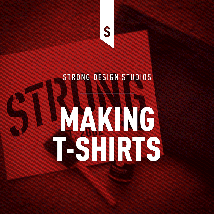
We've been makin' t-shirts!
We recently decided to take a little foray into designing and printing a few t-shirts and wanted to share the process and the results.
We recently decided to take a little foray into designing and printing a few t-shirts and wanted to share the process and the results.
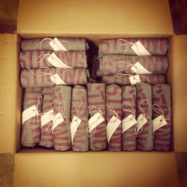
Before going gung-ho with t-shirt printing, we used a stencil and Lumi light-sensitive dye to print a few prototypes (see this handy tutorial for how to create a stencil using freezer paper), and the process really couldn't be easier. Once we knew we liked the results, we ordered negatives from Lumi using their mobile app in order to make printing the shirts a bit easier. We ended up dying close to 50 shirts to send to a few clients and colleagues as a new year's gift, and although creating this many shirts using this process wasn't quick, it sure was fun!
Our t-shirt prototyping process
The final product ready to send out
How to select a WordPress theme
A web presence has become a critical asset to any business, so it is good that you're dedicated to trying to put your best foot forward, despite your limited resources. If you've started searching for themes, you probably already know that there are thousands of WordPress themes available to you. We recently attended a WordPress Grand Rapids meet-up where they addressed this topic, so we'll recap a couple of guidelines they had mentioned below.
I just started my business and can't afford a professional design yet. I've been told that there are a lot of great WordPress themes out there that I could use to get started. Could you help me understand how to select a WordPress theme?
A web presence has become a critical asset to any business, so it is good that you're dedicated to trying to put your best foot forward, despite your limited resources. If you've started searching for themes, you probably already know that there are thousands and thousands of WordPress themes available to you. However, not all themes are created equal. We recently attended a WordPress Grand Rapids meet-up where they addressed this topic, so we'll recap a couple of guidelines they had mentioned below.
Stay away from free themes
If you Google "free WordPress themes" you'll get thousands of results. Ignore all of them. While I'm sure not every free theme is bad, many many of them may contain malicious code that will become part of your site if you install the theme. These themes often embed their malware with something called Base64 encryption, which to an untrained user (and maybe even a somewhat-trained one) is undetectable. For more information on this, you can read this highly intimidating post on wpmu.org.
Purchase themes from a reputable source
After reading that, you should be starting to understand that you get what you pay for. So if you are going to use a pre-designed WordPress theme for your site, you should make sure you are selecting one from a reputable source. A quality theme tends to cost about $75 or more, so keep that in mind as you shop. Once you've located a theme you're interested in purchasing, you can go ahead and check the comments on that theme and do a little Googling before you buy to see what people are saying about it. Here are a few theme sources that are known to be quite reputable:
Themes provide aesthetics, plugins provide functionality
When you start searching for themes, you're going to notice a lot of themes that tout all kinds of functionality they offer. This can be dangerous because if you choose a theme with built-in functionality, any data that you would integrate with that functionality will be useless if you choose to change to a different theme in the future. This is why it is recommended to choose a theme that offers a bare-bones, aesthetics-only approach, and doesn't try to provide a lot of additional functionality. Functionality is best added through the implementation of plugins in addition to your theme.There you have it, a basic list of dos and don't for selecting your first theme. Hopefully this little post will help you avoid the pitfalls of a sub-par theme, and make a great decision on a theme that can get your new business up-and-running online.
Numbers desktop wallpaper
This numbers desktop wallpaper is a bold big brother to our alphabet desktop wallpaper. It is available for download for desktop, iPad or iPhone.

This numbers desktop wallpaper is a bold big brother to our alphabet desktop wallpaper. It is available for download for desktop, iPad or iPhone.

Think we might be a good fit for you?
Let’s talk about how we can design your future.