Phoenix Design Week 2016
PROJECT DURATION
9-month volunteer position
ORGANIZATION TYPE
Conference Event, Small Non-profit
PROJECT TYPES
Creative Direction
Brand Strategy Design
Website Design
Print Collateral Design
Digital Design
Environmental Design
COLLABORATORS
Web Development: Factor1 Studios
Copywriting: Jessie Gould,
Kathy Morgan, & Shaina Rozen
Design Support: Tara Anderson,
Allison Perlis, & Steffan Stewart
Motion Design: Kitchen Sink Studios
Poster Design: Scott Biersack,
Kelsey Dake, & Brock Lefferts
Product Photography: Amy Lamp
Printing: O’Neil Printing
Phoenix Design Week is an annual, week-long series of events to bring together the Phoenix Design Community.
THE SITUATION
Having served as PHXDW Design Chair in 2015, I was excited to step into the Creative Director role for 2016—this time responsible not just for executing a vision, but for originating one. The theme was FLUX: constant change, and the challenge of creating order from chaos. The scope was significant: brand identity, website, social media, direct mail, event collateral, a 50+ page conference program, signage, swag, and managing commissioned poster work. All this work needed to be developed and delivered over the course of several months with a team of collaborators.
With flux as the subject matter and the method, the brand needed to embody change without becoming incoherent—so instead of a traditional logo, the identity system was built around a flexible “anti-logo” treatment: mixed-up type and color that could be reinvented across every touchpoint while remaining unmistakably itself. Order from chaos, made visible.
The campaign was recognized with a Silver Addy Award the following year—an exciting step up from the Bronze earned in 2015. The scope of the work, from brand origin through every physical and digital touchpoint, mirrors what a full fractional engagement looks like in practice: sustained creative leadership over months, held together by a consistent through-line.


The PHXDW 2016 logo represented ‘Flux’ through is mixed typography and dynamic flexibility.
Multiple variations of the logo were created as part of the dynamic system, which further reinforced the concept.

The secondary Method + Madness mark doubled-down on the dynamic type system.

With such a emotive theme as ‘Flux’ the, a set of vibrant colors were selected to support the theme.

Duo-toned photography treatments were a fun and flexible way to unify the disparate speaker photography styles.

A set of geometric patterns were created to be mixed and matched together, creating the feeling of organized chaos.

The website design was one of the most fun websites I’ve ever had the pleasure to design.

A full capture of the conference details website page.

Hundreds of social media graphics were developed to support the promotion of the event.

The promotional mailer that was sent out to announce the dates of the event.

Handout cards that were created to distribute at AIGA events leading up to Phoenix Design Week.

The conference program booklet covers featured metallic silver ink on the “FLUX” hiding behind the logo and pattern.

I just couldn’t get over how fun all of these covers looked together!
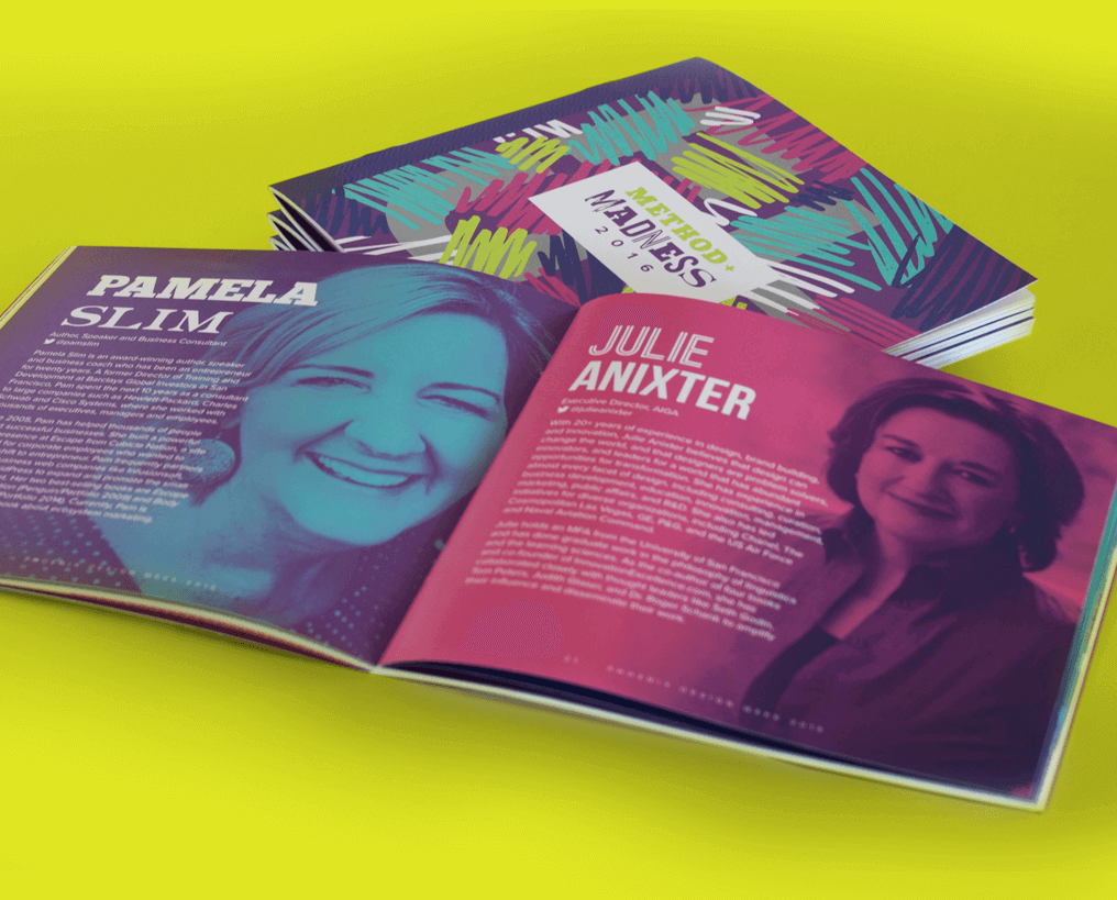
The conference program was over 50 pages, and featured the duo-toned photography treatment throughout.

It is PHXDW tradition to create a poster design for the event. This year four designs were created.
I created the Method + Madness branded poster (middle), and three other local artists were commissioned to design the other three posters.

Temporary tattoos were fun swag given out to conference attendees.

Conference t-shirts were offered in multiple colors and styles.

Conference badge designs were a given, and we also designed multiple designs of pin-back button for the attendees’ swag bags.